What is Responsive Web Design?
Responsive Web Design (RWD) is a modern approach to web development that ensures your website looks and functions perfectly on all screen sizes - from desktop monitors to smartphones and tablets. It adapts your layout dynamically based on the user's device, delivering a consistent and engaging experience.
Why Responsive Web Design Matters
In today’s mobile-first digital world, users expect fast, seamless interactions across devices. A responsive website isn’t a luxury - it’s a necessity.
- Mobile Optimization: Over 60% of users access websites via mobile. Responsive design ensures your site is mobile-ready.
- Faster Load Times: Optimized content and structure result in quicker page loads.
- Improved Usability: A responsive layout improves readability, navigation, and engagement.
- SEO Benefits: Google prioritizes mobile-friendly websites, helping your SEO rankings.
- Professional Look: A polished, consistent experience boosts your brand’s credibility.
Our Approach to Responsive Web Design
At Kaif Shaikh, we specialize in crafting websites that are not only visually stunning but also fully responsive. Our design process is user-focused and performance-driven.
- User & Device Analysis - Understand your target audience and device behavior.
- Mobile-First Design - Start with mobile, then scale up for larger screens.
- Flexible Grids & Layouts - Use CSS Grid, Flexbox, and fluid layouts for dynamic adjustment.
- Media Queries & Breakpoints - Optimize for key screen widths and devices.
- Testing & Optimization - Test across real devices and browsers for consistent performance.
Benefits of Responsive Web Design
- Higher User Retention
- Lower Bounce Rates
- Better Conversion Rates
- Increased Accessibility
- One Site, Multiple Devices
Why Choose Kaif Shaikh?
- Expert Frontend Skills -Proficient in HTML, CSS, SCSS, Bootstrap, and modern frameworks.
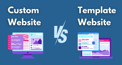
- Custom Design -No templates. Every layout is tailored to your brand.
- Speed & Performance Focused -Lightweight, fast-loading websites.
- Cross-Browser Compatibility -Tested for Chrome, Safari, Firefox, and more.
- Freelance Flexibility -Personalized service, attention to detail, and affordable pricing.


Let’s Build a Website That Works Everywhere
From smartphones to desktops, I create responsive, fast-loading, and user-friendly websites that adapt perfectly to any screen size. Whether your audience is browsing on the go or from their office, let’s make sure they get a seamless experience every time.
Let's Start

Innovative Web Development & Design Blog
Welcome to my blog, where creativity meets technology. Discover articles on web development, UI/UX design, and the latest digital trends. Whether you’re looking for tips, industry insights, or innovative tools, this blog is your go-to resource for staying ahead in the digital world.


Let’s Start Your Web Design Project
Want to launch a new site or revamp your existing one? I'd be happy to get in touch with you. Let's talk about how we can build a site that will support your objectives.
Follow us
Collaborate with us
Building fast, responsive websites with HTML, CSS, SCSS, Bootstrap & Gatsby.js 2+ years of freelance experience.
Services
📩 Get in Touch
Have a project in mind or just want to say hello? Let’s talk I’d love to hear from you!
📧 Email : kaifs9593@gmail.com
📞 Phone : +91-94291 72933
📍 Based in India :
Working Worldwide
© 2025 Kaif Shaikh.All rights reserved. Built with passion and clean code.